
.

Written Identity
Accurate and consistent use of the Cornell Bowers CIS identity across written communications is critical to establishing and maintaining brand strength. Context will drive how we refer to ourselves in writing. Follow these principles:
Formal: Cornell Ann S. Bowers College of Computing and Information Science
- When to use: in all first references to the college in written copy in print and web, and especially in bylaws, business documents, and news items.
Standard: Cornell Bowers Computing and Information Science
- When to use: in ordinary business communications. Feel free to use the shorthand version on subsequent references to the college, after the first reference to the full, formal name.
Shorthand: Cornell Bowers CIS
- When to use: in everyday business communications; for print and web copy—from admission letters to online news items—feel free to use the shorthand version on subsequent references to the college, after the first reference to the full, formal name. The aforementioned shorthand can be shortened to Bowers CIS if the only audience is internal (e.g., email to the college community) or space is limited.
Verbal Identity
How we refer to Cornell Bowers CIS when we talk about the college in our day-to-day conversations is just as vital as the written identity, even more so. Stick to these principles:
Standard: Cornell Bowers Computing and Information Science
Shorthand: Cornell Bowers CIS
Visual Identity
The Lockup
By definition, a brand’s lockup is a combination of design elements that are to be displayed together. They are “locked in,” never to be separated. The primary Cornell Bowers CIS lockup comes in two variations—2-, and 3-line versions—each comprising three elements: the Cornell University seal, the separating vertical line, and the Cornell Bowers CIS wordmark (including a distinctive glyph meaning “and”). Here’s the primary 2-line version:

Online, the seal must always be represented at a minimum height of 120 pixels. In print, the height of the seal must be greater than 3/4″; for print purposes, please contact the Cornell Bowers CIS communications team (comm-office@cis.cornell.edu) first.
Get all college and department lockups via the Download page.
Color Palette
Primary Colors
All lockups, wordmarks, and logos associated with Cornell Bowers CIS must use the primary color palette. When creating any graphic assets associated with the Cornell Bowers CIS brand—from colloquium posters, event programs, and save-the-date email notifications to social media content and other digital media—keep it simple and stick to colors from the primary color palette.
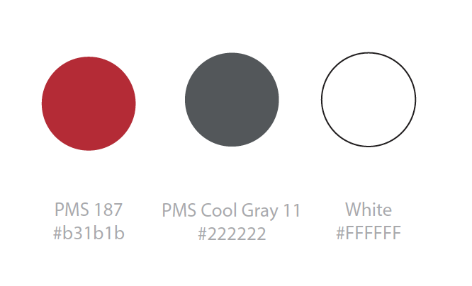 |
Red (PMS 187): #B31B1B Cool Gray (PMS 11): #222222 White: #FFFFFF |
Secondary Colors
Although our primary color palette should guide most layouts, in certain instances other colors may be needed. For those circumstances, refer to the secondary color palette. These colors should not be used as full-color bleeds and should be used periodically and in moderation. Please Note: In no instance should secondary colors become the primary color for the college or a department.
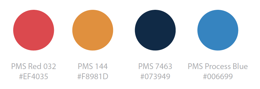 |
Red (PMS 032): #EF4035 Orange (PMS 144): #F8981D Dark Blue (PMS 7463): #073949 Blue (PMS Process Blue): #006699 |
Typefaces
| All lockups for Cornell Bowers CIS and the three departments exclusively use the Oswald font, though with varying letter weights. Oswald is intended to display at larger sizes, so consider it for headers in web and print but avoid using it as a primary font for standard copy. | |
| Source Sans Pro (regular) is the primary font to use when writing substantive text for web and print. Source Sans Pro’s readability makes it a great choice for everyday copy like emails, business letters, and website content. | |
| Default is Cornell Bowers CIS’ secondary header typeface, for use in places like wayfinding signage or as an H2 header in web and print. This typeface is strictly decorative and not to be used for everyday copy. If using, set text in ALL CAPS. |
Get all three of these typefaces via this Box folder.